ABOUT THE PAINTINGS
Painting is a language that embodies a type of thinking. Painting is not producing this or that. Instead, one is thinking in a very practical way. Means precede meanings. Traditionally, painting means pushing coloured mud around on a piece of cloth with a hairy stick. It's a heuristic activity. Its narrative content is determined as much by handling of materials as by the subjects to which it refers. The social, political, and psychological frameworks which contextualize the art will shift. The language of materials is what we continue to read. My job as a painter is to find a pattern, to create abstract loveliness and order, to find a design with which to create a dynamic, satisfying flatness.

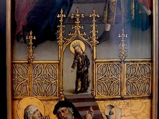
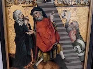
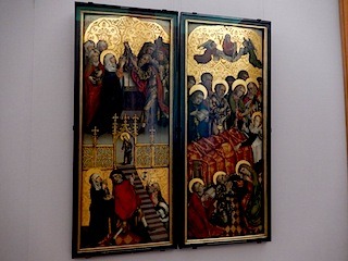
In 2015 I was astonished at the seeming contemporaneity of the circa 1465 Marie-Altar by the notnamed Meister des Erfuler Regler-Altars --obviously a team of painter(s) and sculptor(s)-- in the Alte Pinakothek, Munich. It looks like it could have been painted by Sigmar Polke on a good day in the first decade of the 2000s.
Like 15th century music, 15th century painting looks perfectly at home here in our time, unlike, say,16th & 17th century art, which looks solidly of its own time. Late Gothic painting seems to leap nimbly over five hundred years and plug itself into a contemporary current.

Visual codes from the medieval and the Renaissance cohabit restlessly. Silkscreened-looking graphics sit on gold-leaf ground chiselled into wood.

Figures posed in medieval expressionist stress-stylization wear faces painted in try-hard Renaissance naturalism. The players are cast in archaic anti-natural size-relations. The figure on the right shoulders a wordless scroll like a cartoon-balloon which appears to signify the idea of 'Utterance'.

The clear-cut but unsettled mix of visual codes speaks of the tensions of a transitional age. The parallel one can draw is with the contemporary sense of reality as stretched between organicism and information-cybernetics, the entire world a nerve net.
Dante's Commedia carries the same charge, a poem of exile, political disaster, and spiritual crisis. The original language, even for a non-speaker of Italian, is not difficult to get when accompanied with a translation, and reveals the clockwork precision and ferocious beauty of the rhyme. Dante constructs a detailed counter-world based with precision on the facts of the real world, the way the dreaming mind creates a burlesque of the waking world. This is the juice that art seeks to plug into.
The Commedia, for all its world-building, is also an interior drama. The sauna is a pressurized space coequally infernal, purgatorial, and paradisiacal, built on three levels, housing figures who are naked and vulnerable, as well as serene and exalted.
The Sauna: Divine Comedy series has emerged as a continuing response to the possibilities freed up by splicing together fertile ideas. The paintings do not illustrate the poem, but rather use it as a matrix to tell stories with a cast of figures, with the painterly demands that this requires.
I've known the set of paintings and verses called the 'Zen Ox-Herding Pictures' or the 'Ten Bulls', based on the twelfth-century Chinese illustrations by Kakuan (c.1100-1200), since high school when I met the modern woodblock versions by Tomikichiro Tokuriki in 'Zen Flesh Zen Bones' (Anchor Books, 1961) by Paul Reps. The sequence describes the process of recognition of self as not different from phenomena.
The Bulls have been prototypical for artists in Asia for centuries. Since the 1950s they've been a recurrent source in the west: John Cage painted an abstract version of them in 1988. Leonard Cohen based his 1978 song 'Ballad of the Absent Mare' on the verses which accompany the pictures. And of course there is Cat Stevens' 'Catch Bull at Four'. Over the years I've found the allegory condensed in the work to be a useful shorthand to describe psychological content. Just as we can speak of someone being a typical Leo or Libra without necessarily subscribing to the tenets of astrology, so likewise concepts like the ten bulls express fundamental ideas realised in terms of visual unity, cohesion and organicism.
Once at a yard sale I found an old book aimed at 8 to 12 year-old readers, of the sort based on once popular tv shows, titled 'Bonanza: Killer Lion' (Whitman Publishing, 1966). The ten line-drawing illustrations, credited to 'Jason Studios' seemed to match perfectly the sequence of the ten bulls, if one accepted a rapidly-growing baby mountain lion as substitute for an ox, and Hoss Cartwright as the seeker. For a painter it was a golden idea: an arbitrary set of nearly meaningless images that mirrored the deep content of a classic work.
This coincided with a period in which I had re-invented my painting style from scratch. I needed a kind of painting that was both strongly graphic and entirely based in the materiality of paint in equal measure; one that was non-lens-based, and that was more dependent on systems of painting than on the facts of the visual world, but nevertheless transparently open and legible as analogues to things in the world. These Bonanza/Bulls paintings are translations from archaic, simple, almost mnemonic icons of a psychic process: an elliptical, almost senseless narrative in an outmoded style, concerning a cowboy and a cat.
It should be noted that while I'm invested in making a set of objects in which this concept is embedded in four hundred square feet of oil on canvas, I hold no affiliation with any group or school. This is material I've lived with for years and consider part of a common mythos. My concern is with art. No one is in any danger of enlightenment through contact with this work.
BODY OF WORK 2021 - ongoing
The premise of the series is that the production of art (any art) is part of a continuum of activity that involves every sector of society. This chain stretches from the manufacture of raw materials, to the running of exhibition venues of all kinds, to the discourse that backs up a work's valuation in culture and history. Curators, collectors, critics, editors, appraisers, professors, gallery owners. The artist is one participant in the midst of this spectrum. The art is not sealed off from other social activities. This may be a healthy state of affairs, a social ecosystem. It's also a good way of making art, by looking at how art works in our time and in history, what makes people do it in the first place, and the diversity of approaches to creativity. The work is about how in our time the artist is as much responsible for creating an audience as for manufacturing a body of work. The paintings are about how art is funded, shown, and dealt. The works operate as a series so that each piece refers to the others, like chapters. The paintings stand alone, yet function as a story, with character types, patterns, and techniques reoccurring throughout.
This premise has sustained my commitment because of the way it generates ideas from the real world using painting's main strength: paintings basically are about their own compositional techniques and formal structures. More than photo and video, which get much of their content from the real world via the lens, paintings have to create their own context. This gives painting latitude to portray situations that can't be seen directly, such as time, systems, and processes. In these paintings I use what I understand and learn about the behaviour of large fields of art as the subject matter of the work.
The paintings based on red ground are concerned with the fields of art activity in the larger social system, the main theme of this series.
This one, of a drinking party, is about the first audience that artists pitch to: other artists, the ones who serve art at its engineering level. A non-artist might encounter an unfamiliar single painting and find it puzzling and maybe overly specialized. Seeing a show of a dozen can put it in a context where it makes sense. Artists are primed to get the drift of art quickly, like a sight-reading musician. It's a skill that can be taught or acquired through experience. The challenge for artists is to offer others a way in to their work, while permitting their art to remain a step ahead of their own understanding.
This is one of a series of attempts to map the reoccurrence of cycles of style and fashion in culture. Objective, classical attitudes give way to subjective, romantic eras. The marginal becomes the mainstream; the end of a style presents itself as the opposite of its beginning. You can see it looking back even a few decades. You know when a style or a work becomes not just popular but inevitable: when you understand what the thing is about without having read the book, seen the film, heard the music. The past is unpredictable, and nothing ages faster than the future.
The forms in the painting are based on emblems containing all the letters of the alphabet entwined or hidden, one an 18th century Rococo-decorative pictogram, one an austere 20th century Bauhaus-style logotype, standing in for period ways of thinking, speaking, and seeing: the distance between the wrought-iron prose of Edward Gibbon's 'Decline and Fall', and the professional economy of "Houston, we have a problem". A theme of this series concerns how cultural factors influence what is seen as visually attractive at any particular time, and how widely this is shared among people.
The title is from Lewis Lapham's observation about "the paralysis of mind characteristic of any institution rich enough to afford, at least temporarily, a private and preferred theory of reality".
This depicts a collector, a dealer, and a stable of artists, illustrating character types: a reliable pro with an academic reputation (signified by the footnote), an intellectual, a young bad boy, a New-Age mystic, a Surrealist with an academic reputation, an aging bad boy.
Talent is interesting because at some level the only reward for talent is more work, the chance to apply the talent further.
Many artists live conservatively in order to be radical in their art. This scene of domestic life is the counterpart of the previous studio picture. This is an example of the figurative approach in these paintings. The figure with oven mitt and mini-skirt is giving birth. The grub-shaped artist figure dreams of a mind child. The world of actual children and imaginative offspring is not set into compartments but part of the same incubator of work.
This is a study of ways a biographer or historian would look at an artist: as the private individual with an inner life, as the public figure, as the figure in art history and as the persona in art myth.
Artists have long had great class mobility. This painting examines how they've served as the vanguard for new forms of behaviour and high living for the leisure class, and how the influence has operated in both directions.
The paintings based on yellow ground are concerned with how people experience the creative instinct differently. Following the taxonomy of creative archetypes discussed by James Hillman in 'The Myth of Analysis' (Northwestern University Press, 1972), I draw the possibilities into a number of categories:
1) Creativity through method, structure, and objectivity. Art as an escape from personality.
2) Creativity through novelty, subjectivity, and self-disclosure. Art as an expression of personality.
3) Creativity through rebellion and irrationality; the sex, drugs & rock 'n roll style.
4) Creativity through a persona, using the self as a symbol around which is woven a mythology.
5) Creativity through cultivation of a receptive attitude, which like the seasons, has periods of fertility and barrenness.
6) Creativity as a utilitarian process of invention and puzzle solving, a small bit of inspiration and a large amount of perspiration. This is the archetype illustrated in this image.
This image concerns the artist type who has the ability to take what's happening in the here-and-now and channel it into art.
Categories of creativity aren't ironclad, and circumstances can force a switch from one method to another. Most artists are mixtures of types. No type is inherently privileged, there is no essence of creativity. Categorization is a mental tool that helps to unify ideas by first separating them. Irrationality has its place, and art isn't contrary to tradition and structure.
A short text about the origin of the 'head' or 'face' motif is here: www.onninordman.blogspot.ca
This precursor series to the 'Body of Work' is about how artists cultivate their creativity throughout the stages of their lives. In the simplest form, this is the idea of the significance of 'early', 'middle', and 'late' styles. In a biographical overview of a given artist's oeuvre the life and the work can fall into a very dramatic arc in which a given stage functions heuristically, one phase of work yielding the organizing principle for the next. The particular cycles may look as varied as seed, sprout, leaf and fruit from one another, but I've come to trust that roots are parallel with branches.
We fall for an early work-- the first sight of a painting or a style, first film, first record, first novel. Its rawness, greenness, broadness, budget limitations, are never more likely to be overlooked or forgiven than during infatuation. Revisiting work later, particularly when you have a comprehensive grasp of the catalogue, shortcomings may be indulged as an index of contingency, proof of necessity prevailing over disadvantage. This serves as a measurement of the achievement throughout the life's work.
LENTICULAR PAINTINGS 2006 - 2010
These are painted on grids of lenticular panels, specifically: accumulations of 17 X 26 cm dollar store 3-D devotional prints, mounted on supports of wood and board which are fitted such that they can be hung in any direction.
This ground throws down an abundance of painting problems. The panels are preposterously anti-flat reflective fields which present a constant illusion of movement. They are chromatically and structurally over-saturated, as well as loaded with ideologically weighted subject matter, and they are kitsch.
The game becomes one of imposing the new painting organization over an existing ground which is laden with an architecture of grid, gimmickry, illustration, representation, pattern, illusion, and independent chroma, all on a material surface --gridded plastic-- which is markedly receptive to interesting forms of paint taction while being at the same time nearly as unforgiving to second thought as is watercolour paper.
The burr men are modelled from the seedpods of common burdock (Arctium lappa), which has become progressively uncommon since the first one built in 1986. That one was an over-lifesized bust made entirely from an accumulation of burrs without an interior armature. They were picked from backlots and alleys in downtown Sydney, Nova Scotia, and there was no scarcity of material. The pods make for a satisfying modelling stock. Essentially modular, they assert their own biotic character, but become ductile and depictive in accumulation.
By the time a second piece was built in 1998, the plants had dwindled in or disappeared from their previous habitat. It took weeks of searching the edges of the city to gather enough seedpods to mold the figure around an armature made of wood.
By 2011 burdocks, like sparrows, had vanished from the city, so the third and fourth versions were made with plants from a cattle farm in the country where they flourished in benign neglect. The urban burdocks had not, for the most part, been eradicated by human intervention but expunged by some other biological factors.
The tar ponds stain painting was a way of taking a sample of a century's worth of industrial effluent discharged from the Sydney, Nova Scotia steel plant. Waste minerals, sludge, and chemicals had concentrated in a small lake in the city centre for several generations before being cleaned and capped in the second decade of this century. The sampling of 1999 made for a reasonably elegant stain watercolour on canvas.
Cape Breton Spectator article
2017
https://capebretonspectator.com/2016/10/19/onni-nordman-ten-bulls-jessome/
Süddeutsche Zeitung article
2015
http://www.sueddeutsche.de/muenchen/pasing-buddha-und-bonanza-1.2479980